| WWT Shows | CLICK TO: Join and Support Internet Horology Club 185™ | IHC185™ Forums |

|
• Check Out Our... • • TWO Book Offer! • |
Welcome Aboard IHC185™  Internet Horology Club 185
  IHC185™ Discussion Site Main Page
  Horological Discussions, Questions and Answers
  Clocks, Including 400-Day Discussions
  Clock opinions and suggestions
 Internet Horology Club 185
  IHC185™ Discussion Site Main Page
  Horological Discussions, Questions and Answers
  Clocks, Including 400-Day Discussions
  Clock opinions and suggestions
Go  | New Topic  | Find-Or-Search  | Notify  | Tools  | Reply to Post  |  |
| IHC Member 1101 Site Moderator |
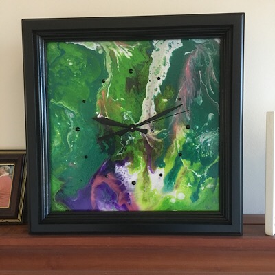
So here is the laydown, my sister-in-law enjoys doing this form of art work on various types of media from canvas, clay tile, and even plywood board. In this case, it is a 12” x 12” piece of quarter inch ply wood. She cranks these things out because she enjoys doing it but really has no idea what to do with them after they’re done. You can only have so many of these pieces in your house. So I suggested to her that maybe putting a clock face on it with a movement and seeing how that works. I was then volunteered to undertake this endeavor. So here is the finished product. I was wondering what you clock connoisseurs thought about this design as well as maybe another source for hands and movements. The stuff here came from combination of Michael’s art store and ClockIt for the movement and hands. I made the frame so it can sit on a shelf or mantel or be hung on a wall. Your help and opinions would be sincerely appreciated  | ||
|
Steve I always like this old thread from 2003: The places an artist could go with it this idea. Time is color Mike | ||||
|
| IHC Member 1291 |
It looks very nice indeed Steve. regards, bb | |||
|
| IHC Member 1613 |
Like it... | |||
|
| IHC Member 1101 Site Moderator |
Thanks guys, I appreciate you comments. Here is another one I just finished, it was done on canvas. I am now working on a wall version that is done on a circular disk, I’ll post when it’s done.  | |||
|
| IHC Member 1101 Site Moderator |
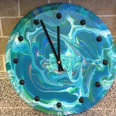
Here is a wall mounted creation.  | |||
|
| IHC Member 1291 |
This round one has a lot of eye pop and would appeal to a lot of varied peoples. regards, bb | |||
|
| IHC Member 1101 Site Moderator |
Thanks Buster, I’m preparing two more of these round ones for the s-i-l to paint. It’s like a box of chocolate.....you never know what you’ll get. | |||
|
| Life Member |
I like the round one best, but I think that is because there is good contrast between the hands and number pips and the background color. I think the darker ones would be improved by using white pips and hands. Just a thought. | |||
|
| Administrative Assistant |
Steve, I do agree with David's suggestion on the color contrast. And like Buster, I too like the round clock one that you did. | |||
|
| Powered by Social Strata |
| Your request is being processed... |
|
©2002-2025 Internet Horology Club 185™ - Lindell V. Riddle President - All Rights Reserved Worldwide

