
| WWT Shows | CLICK TO: Join and Support Internet Horology Club 185™ | IHC185™ Forums |

|
• Check Out Our... • • TWO Book Offer! • |
Welcome Aboard IHC185™  Internet Horology Club 185 IHC185™ Discussion Site Main Page Our Exclusive "Timekeepers Photo Gallery" How to Photograph Your Watches and Clocks Background Color
Our Exclusive "Timekeepers Photo Gallery" How to Photograph Your Watches and Clocks Go | New Topic | Find-Or-Search | Notify | Tools | Reply to Post |
When taking photo's of watches/movements, what color backgound do you feel is best? I'm slightly colorblind, so for me Dark Blue/Black seems to highlight better with a Olympus C4000 Zoom camera. Whats other opinions? Thanks!  | |||
|
Professional photographers have told me they prefer what is called 18% grey as a background. I think that means that 18% of the light is reflected. Is that correct? | ||||
|
Jerry Thanks for the input - here is a sample of different color backgrounds taken within 5 minutes of each other, same lighting, C4000 Zoom - auto settings, Ott Lamp, cloth background (old t-shirts). Whats others opinions?  | ||||
|
| IHC Life Member |
Here's a background for ya. Done using one of annoying free AOL cd's. It certainly creates a neat visual effect. Larry IHC Member 25 IHC Life Member (L6) 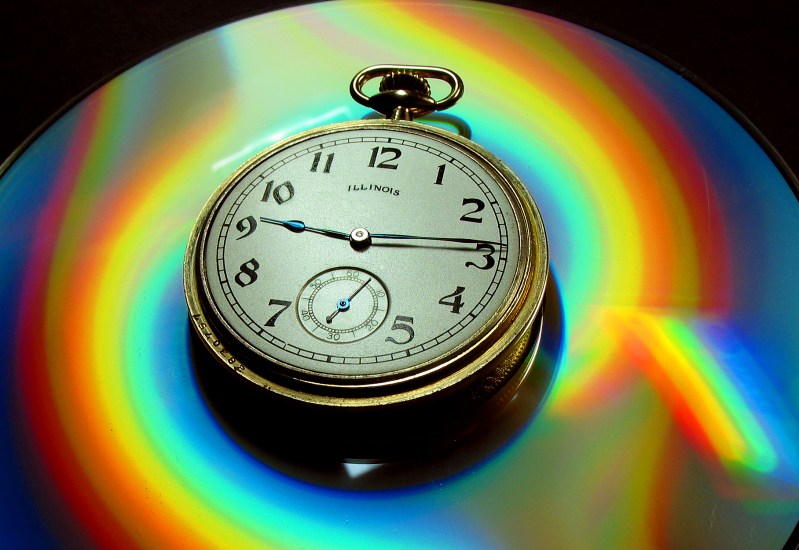 | |||
|
Larry, What a unique backdrop you have discovered there. Thanks for sharing it with us! Phil Dellinger NAWCC# 157070 IHC Life Member (L12) | ||||
|
 |
Most really good shots that I've seen have either an almost non discernible or deep blue/purple background. Sam Williamson NAWCC 154312 IHC Charter Member 14 Member Chapters 96 and 185  | |||
|
I prefer lighter backgrounds, myself. I usually use a light gray manilla envelope. When I use a darker color I tend to lose the edge of the case in shadow as it curves back and starts to reflect the background. I also have more difficulty getting the exposure just right with all of that dark area in the picture. | ||||
|
| IHC Life Member Moderator |
This is a very late post, but as a former Pro photogrpher, the 18% grey card is used to calculate the light balance for photography. For example if I photograph a certain item for a catalog where true and accurate color balance is a must one uses an 18% grey card in the photo as a test. Then without changing any of the parameters, take the final shot you want. The first one then is used to have the 18% area read by a color analyzer which will equally reflect all colors, and therefor be able to have the color enlarger set precisely for that color balance. Assuming the color chemicals are corrctly balanced then the product will look exactly correct in the catalog as in person. Moses, formerly "Photos by Moses" | |||
|
Moses, Thanks for your reply to this topic. Where can I get one of these 18% grey cards? | ||||
|
| IHC Life Member Moderator |
....Go to a professional photo store that sells Kodak supplies. They used to always carry it. The smaller stores never heard of the 18% card but bigger ones had them in stock....but then again that was before the digital age. Moses | |||
|
| IHC Member 376 Watchmaker |
I have had good luck with a medium blue color background when using the digital Camera .i have found that the rules are somewhat different with a digital camera than they are with say a 35mm . A yellow gold or gold filled case looks good on a blue background. | |||
|
| Site Administrator IHC Life Member |
Wayne, thanks to my mother's genes obtained from her father(my grandfather), etc. I am more than slightly color blind. The darker blue are purple colors will look better to color blind people as they are easier to see and make a better contrast. Just a little trivia, here on a beautiful Monday morning. | |||
|
| IHC Member 234 |
...right Phil, let's hear it for the colour blind people... | |||
|
| Powered by Social Strata |
| Your request is being processed... |
©2002-2025 Internet Horology Club 185™ - Lindell V. Riddle President - All Rights Reserved Worldwide
| View $GS_USERNAME's User Profile | |
| View Recent Posts by $GS_USERNAME | |
| Notify me of New Posts by $GS_USERNAME |