
| WWT Shows | CLICK TO: Join and Support Internet Horology Club 185™ | IHC185™ Forums |

|
• Check Out Our... • • TWO Book Offer! • |
Welcome Aboard IHC185™  Internet Horology Club 185
  IHC185™ Discussion Site Main Page
  Horological Discussions, Questions and Answers
  Pocket Watch Discussions
  Are these case intials LJC?
 Internet Horology Club 185
  IHC185™ Discussion Site Main Page
  Horological Discussions, Questions and Answers
  Pocket Watch Discussions
  Are these case intials LJC?
Go  | New Topic  | Find-Or-Search  | Notify  | Tools  | Reply to Post  |  |
Ok guys get out your steady cam for this image. It's on the back of a nice 20-yr Boss case the is still housing the original 1901 18s PS Bartlett. What do you think these intials are? I luckily don't have too many cases that have been personalized, but this one has, so if I could at least know the letters I could make up a name like "Lumber Jack Canuk"..grin Thank you, Roland. R. Glenn 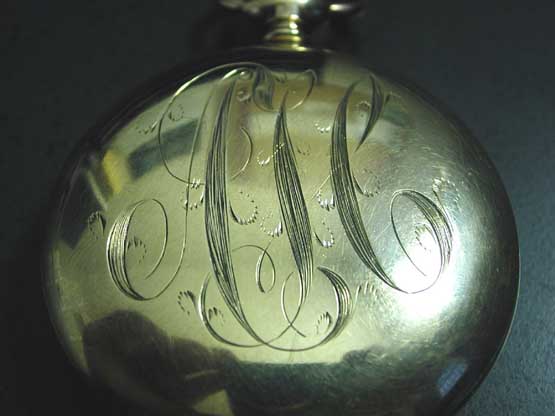 | |||
|
| IHC Life Member |
Left to right A S C Trust me. | |||
|
| IHC Life Member |
A S C or A L C Regards, Jerry | |||
|
Looks like ASC to me as well. | ||||
|
Take it from an old Drafting student armed with a calligraphy book - AJC. | ||||
|
Hmmm. Yeah, that does look more like a J than an S. | ||||
|
| IHC Life Member |
Take it from a calligrapher that does that type of work, it's an S. I'll tell you why. The spine of the decender, the thick part, curves in the manner of an S in that style of lettering. Had it been a J there would have been an ascender on the left of the letter. I'm going to tell you something, not to boast but as a point of referrence, I'm a member of the International association of Master Penmen, Engrossers, and Teachers of Handwriting. It's the IHC185 of the script world. When I have a moment I'll draw out the letters and their derivations and post them. In script writing there's several facets. Business writing, engrossing script, ornamental penmanship, and signature and monogram writing, What may be confusing to some is that in signature and monogram writing letters are carefully connected, or placed close to one another to form a design of the letters rather than their full letter forms. | |||
|
| IHC Life Member |
I did a quick example using a Sharpie pen that's a little indelicate for this type of work but for the sake of the discussion it will serve our purpose. The top letters, seperated, are A J C, The bottom is A S C 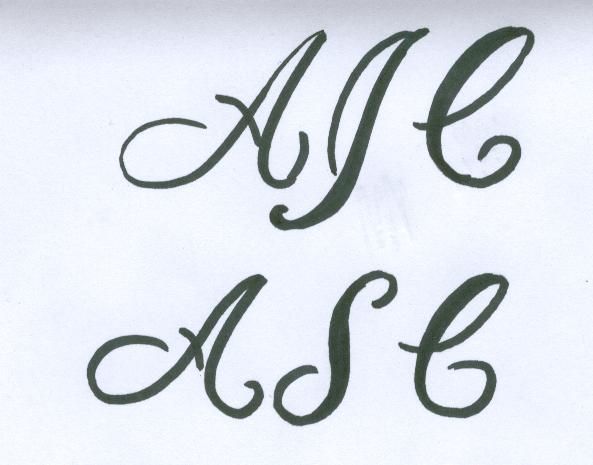 | |||
|
| IHC Life Member Site Moderator |
Kind of like this ASC 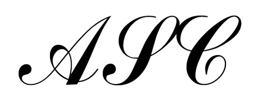 | |||
|
| IHC Life Member Site Moderator |
Sorry Mitch Didn't mean to post too, I was playing with ADOBE & did that & then after I posted saw you did what I can't, free hand. Tom | |||
|
| IHC Life Member |
Tom, No need to apologize but if the tables were turned I'd be the first to say I was sorry. That's great that you ran that on a program. PM me your mailing address and I'll send you a "fancy" letter. I practice about 2 hours every evening to keep in shape. You may have seen old train orders from the period. Every word was connected by a long swoop. A train order operator's handwriting was known as his or her "fist." | |||
|
| IHC Life Member |
IAMPETH Here's the link to the penman group I belong to. Give yourselves some time in brousing through the examples. | |||
|
What a great site Mitch, very informative. I spent an hour on it and barely touched the surface. | ||||
|
| IHC Life Member |
Ray, Thanks for your kind response. Script, especially ornamental penmanship can become adicting. I started with it 46 years ago and I can't stop. I can go through 50 sheets of paper in an evening. If anyone out there would like assistance with script feel free to email me. The members of IAMPETH are as dedicated and helpful to beginners of script as we are here to the watch folks. Enjoy! | |||
|
| IHC Life Member |
Earlier thread A few weeks ago we had another thread on questioned initials. That time the S was discussed as perhaps being an F. The initial on its left is definately a J. Take a look and compare. I apologize for beating a dead horse but I found this all interesting. | |||
|
Thank you Mitch!!! So AJC it is. Now to come up with something that will make it mine. How about "Any Jewel Count". Thanks again, Roland. R. Glenn | ||||
|
| IHC Life Member Site Moderator |
I thought it was agreed the case in this thread is ASC ? Tom | |||
|
Opps Tom. After looking at this again, I can't see the S as the top curves don't match the bottom on that letter. To me it still looks like a letter J. I know see the A and the C for sure, but that middle one....hmmm. Roland. R. Glenn | ||||
|
Does this image help or just make it worse. The middle letter curves and then goes back into the letter A which to me looks like the top of a J. Roland. R. Glenn 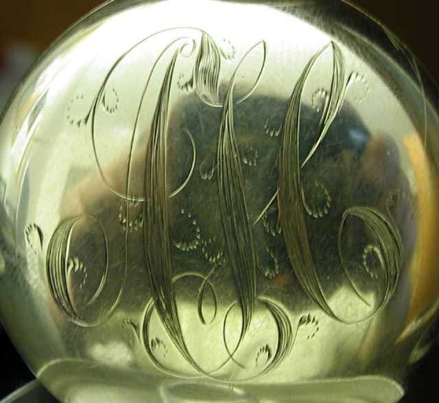 | ||||
|
| IHC Life Member Site Moderator |
Just so you know, like most things I know very little, so the reasons I say it is a "S" is because Mitch does & when I use photoshop to make them it looks like an "S" there too. Here is a capital S & lower case s, below that is a capital J & lower case j. 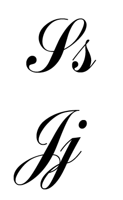 | |||
|
Agreed! Thanks everyone, much appreciated as always!!! Roland. R. Glenn | ||||
|
| IHC Life Member |
All by itself the letter in question could be interperted as a J. However, in that style of script, along with the style of the A and C and the way it all flows together, and by the very way the under loop of the top of the letter in questioned is formed, it is indeed an S. Take a look at the J S of the earlier thread I linked to above. Look at the J on the left of the 2 initials, then look at the S on its right. Remember in this earlier thread the discussion was if the S was an F. It's the curvacious spine and attending loops that tell us in both examples the letter is an S. In those days a J would have had the ascender swing up to the top on the outside. Similar to Tom's example. The treatment of the bottom of the letter in question is consistant with an S. Had it been a J the bottom would have extended slightly lower than the A and C and form a long loop to the left. There would be no reason for an engraver or penman for that matter to change letter style mid monogram, and make a questionable looking letter for their contemporary audience. The era this was executed in demanded a specific guidline to letterforms as ornamental as the monogram may be. I re-drew the intials of the watch had they been A J C in the style of the existing monogram. 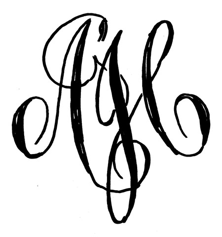 | |||
|
Thank you Mitch, I see what you mean. Very much appreciated! Roland. R. Glenn | ||||
|
| Powered by Social Strata |
| Your request is being processed... |
|
©2002-2025 Internet Horology Club 185™ - Lindell V. Riddle President - All Rights Reserved Worldwide

