
| WWT Shows | CLICK TO: Join and Support Internet Horology Club 185™ | IHC185™ Forums |

|
• Check Out Our... • • TWO Book Offer! • |
Welcome Aboard IHC185™  Internet Horology Club 185
  IHC185™ Discussion Site Main Page
  Open to the World RESEARCH FORUMS
  South-Bend Watch Company Research Forum
  South Bend 429 with strange looking dial labeling
 Internet Horology Club 185
  IHC185™ Discussion Site Main Page
  Open to the World RESEARCH FORUMS
  South-Bend Watch Company Research Forum
  South Bend 429 with strange looking dial labeling
Go  | New Topic  | Find-Or-Search  | Notify  | Tools  | Reply to Post  |  |
Friends, I came across this auction on ebay that didn't look right to me. Here are a few photos for review. 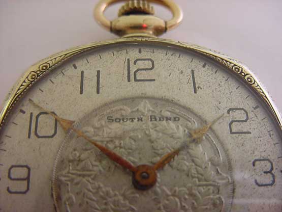 | |||
|
Another photo side view. I don't remember ever seeing a South Bend fancy dial with the name written in the fancy part of the dial. Doesn't the name script look just a little to black in relationship to the rest of the dial's aging? This example just doesn't look correct to my untrained and learning eye. I am sure Frank K. can set me straight. Thanks 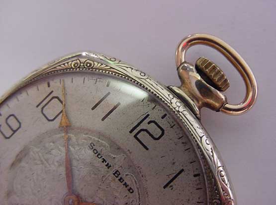 | ||||
|
| IHC President Life Member |
John, First, for those unfamiliar what we are discussing here is a painted metal dial. What you want to look at on that particular dial is the comparative roughness of "South-Bend" signature and lack of any remaining sharp detail in the background design. What you see there is a rather poorly redone dial that also shows a lot of aging since it was last redone. Both the numbers and signature on most redone dials will have a "fuzzy" look such as you see on that one, whereas an original dial will be sharp and clear. Frank has had some South-Bend dials redone that have turned out nicely. Perhaps he can tell us more about the process. The heavy wear you see on that case, the not-so-nice dial and hands along with the fact of it being a comparatively common movement would cause me to be looking for a much nicer example. Remember there were some 96,000 of the 429 produced so you can be picky about them. Having "South-Bend" in that fancy center area can in fact be original, I found four originals of similar design in my collection. Unfortunately, at one time having a metal dial redone was part of having the watch serviced. For that reason, today most collectors place a premium on original dials. Lindell | |||
|
Lindell, I appreciate the information and input. I don't doubt there were dials made with brand name script in the fancy part of a dial, but as I said I felt the way it was done here just didn't look right. IMHO I think the South Bend almost detracts from the beauty of the dial instead of enhance it. I would like to see one or two photos of your examples with the brand name script inside the fancy dial location for us to compare if not to much trouble Lindell. Thank you again for the information. John | ||||
|
| IHC President Life Member |
I'll try to post a picture or two tomorrow John. Meanwhile, a 1920 South-Bend advertisement showing a fancy design with the South-Bend signature between 10 and 2 on the textured area. 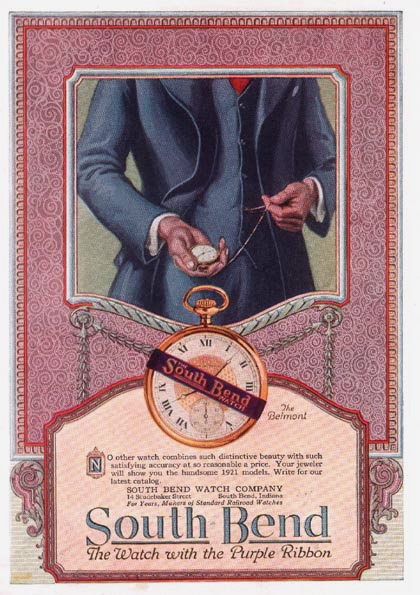 | |||
|
| IHC President Life Member |
John, As promised, here are a couple South-Bend dial close-ups. These are typical of 1920s dials from practically all the watch companies. As an example this Waltham from 1926 sold recently in one of our Chapter 185 Auctions... IS THIS PRETTY WALTHAM A 17-JEWEL? NO, IT'S A 19 JEWEL! Here's a South-Bend 411 from 1921 production... 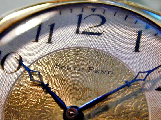 | |||
|
| IHC President Life Member |
Another South-Bend 411 from 1923 production... 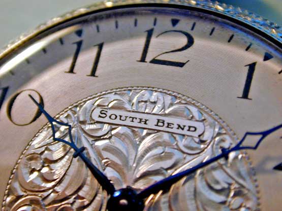 | |||
|
Lindell, Thank you so much for the photos for me to compare. It is very easy to see that the dials you show are very different then the auction version. Thanks, John | ||||
|
| IHC Vice President Pitfalls Moderator IHC Life Member |
I'll second that John! IMHO one of the most important resources that Chapter 185 provides to members is the always-growing accumulation of pictures of correct examples in nice condition. That way members can have a true basis of comparison when considering a purchase. For example, Lin just showed us what correct & pristine South Bend fancy metal dials look like. Having seen those, one is not as likely to get all excited about a redone and timeworn example such as the original subject of this thread. Best Regards, Ed | |||
|
| Powered by Social Strata |
| Your request is being processed... |
|
Welcome Aboard IHC185™  Internet Horology Club 185
  IHC185™ Discussion Site Main Page
  Open to the World RESEARCH FORUMS
  South-Bend Watch Company Research Forum
  South Bend 429 with strange looking dial labeling
 Internet Horology Club 185
  IHC185™ Discussion Site Main Page
  Open to the World RESEARCH FORUMS
  South-Bend Watch Company Research Forum
  South Bend 429 with strange looking dial labeling
©2002-2025 Internet Horology Club 185™ - Lindell V. Riddle President - All Rights Reserved Worldwide

